I was lucky enough to have the opportunity of attending Reasons to be Creative 2015 in Brighton a couple of weeks ago. I had attended its predecessor, Flash on the Beach, a couple of times but I’d never been to this new incarnation since it started a few years ago. I’m really hoping I will get to go again next year as it’s an amazing event.
The three days consist of some incredibly impressive and inspiring speakers (including artists, illustrators, designers, makers, hackers, developers, film-makers and CEOs), some great ‘how-to’ sessions, demos of latest creative software and a very positive atmosphere of creativity. Even just being in the presence of several hundred other digital creatives is a motivational experience. You feel like you’re in the right place. And it certainly affirmed to me that I am definitely working in the right field, as I felt completely at home. Even if I won the lottery and could retire early I would still come and attend this event each year.
It’s a great location they have as well, in such a creative town as Brighton, with the venue just minutes walk from the beach, the pier, the Lanes and also my fantastic B&B at Guest in the City. A massive hat tip to John Davey and his entire team for putting on such a great event. Everything about it was so professional, friendly and welcoming.
Some highlights for me…
Dominic Wilcox
Dominic is incredible. A tour de force of original thinking. He was a great speaker too. Although billing himself as an introvert he had a great stage presence and a lovely dry sense of humour. This session was worth the price of admission on its own. He has a very practical and hands-on sense of design which is illustrated by his hydraulic grabber made using syringes, a great illustrative style as demonstrated by his slide titles and quirky little animations, and a wonderfully anarchic imagination as shown by most of his work, such as the headphones that make your left ear hear what is coming from your right hand side and vice versa. I also really loved the eyes on his robot cereal spoon. The animation on those eyes totally brought that inanimate object to life in such a fun way. Make sure you watch the short film about him below. So refreshing to see a creative mind like this at work. It makes me very happy that there are people like Dominic Wilcox in our world.
Website – http://dominicwilcox.com/
Twitter – https://twitter.com/dominicwilcox
Video (a must watch) – https://vimeo.com/122959827
Robot cereal spoon – https://www.youtube.com/watch?v=iVqlQRnyW08
Book – http://www.amazon.co.uk/Variations-Normal-Dominic-Wilcox/dp/022409887X/
Noma Bar
I would go so far as to say that Noma is a genius in his particular field. His illustrations are so, so clever and he has done it so many times that it is definitely not a fluke. He is able to portray someone’s personality using just a handful of lines and he is a master of the use of negative space to combine images in creative ways. He has the ability to make things seem so simple that you think ‘Oh yeh, I could do that.’ But having done caricatures in the past I know just how hard that is, and Noma’s style is the purest form of that art. This session came right before Dominic’s and combined to make the most inspiring 2 hour session of the event.
Website – just shows his cool dog/cat/mouse image – http://nomabar.com/
Twitter – https://twitter.com/noma_bar
Chicken Mouth – http://www.opticalillusioncollection.com/2013/09/chicken-mouth-optical-illusion.html
Other images – https://uk.pinterest.com/explore/noma-bar/
Book – http://www.amazon.co.uk/Guess-Who-Many-Faces-Noma/dp/0977985075/
Jane ni Dhulchaointigh from Sugru
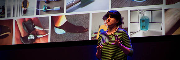
I was very aware of the Sugru product before I attended the event but I hadn’t used it yet. I knew nothing about the company or the CEO so I was fascinated to find out that the CEO was a young Irish woman who had attended art school (the same school as Dominic Wilcox interestingly – small world). It doesn’t really surprise me now though because it’s such a clever product and so cleverly marketed that I think it really had to be a creative person behind it who was able to think outside the box and not be restrained by normal parameters. Jane’s session was great as it showed how the company was founded, had extremely practical lessons to be learned, demonstrated some extremely clever and creative ideas and also managed to include many inspirational quotes such as “You don’t have to be an expert. Learn it”, “Start small, make it good” and “Design for impact, not just for the thing itself”. I wasn’t expecting to hear from a speaker like this on the event, so it was a hugely pleasant surprise. It’s great to hear from designers who have made a real impact in the business world.
Website – https://sugru.com/
Twitter – https://twitter.com/sugru
Video – https://www.youtube.com/watch?t=8&v=lXR48LE9X1Y
Magnet Kit – https://sugru.com/buy/magnet-kit
John Hicks
Very interesting to hear John speak, as he is the illustrator behind such great logos as Firefox and Mailchimp.
http://hicksdesign.co.uk/
https://twitter.com/hicksdesign
James Hall – Security
An extremely enlightening, and sometimes depressing (not James’ fault) look at how to keep yourself more secure online. Basically if someone wants to hack you, they will. There are ways you can make it harder for them, but if someone wants to hack you, they will. Extremely eye-opening, and I rarely used the public wifi after this session!
https://parall.ax/
https://twitter.com/MrRio
Ros Horner – Setting Goals
This session was great as a motivational, get off your arse and do it, goal setting session. I joined in and submitted my goal which was to build a retro arcade machine of my own.
https://twitter.com/roshorner
Yuko Shimizu
Great talk by Yuko, about how you are never too old to reach for your dreams.
http://yukoart.com/
https://twitter.com/yukoart
Danny Yount
This was another huge name for the event. Danny is the creative mastermind behind movie titles including the Iron Man movies, RocknRolla and Sherlock Holmes. Very interesting to see behind the curtain of someone actually working in Hollywood.
http://www.dannyyount.com/
https://twitter.com/dannyyount
How-to Sessions…
Mike Brondbjerg – Using Data in your Creative Process
Mike did a great session on using data in your creatively. I’m very interested in Data Visualisation and his sessions focussed on using some Javascript techniques to help you create interactive display methods. I just loved his approach and how he built up his demo step by step from a very simple start to make sure people were following along and then adding layer upon layer of complexity. Some fantastic examples of his work (mentioned in a very relevant way) including the vector polygonal images of US Presidents.
http://www.brondbjerg.co.uk/
https://twitter.com/mikebrondbjerg
Chris Gannon – Animating SVGs
This was a real highlight for me from the event, in terms of practical takeaway skills. Chris demonstrated how to create an SVG animation. SVGs are really hot right now, as a very light way to have scalable graphics online, and while there aren’t a huge amount of tools to animate SVGs Chris demonstrated the fundamental theory behind it whilst taking us through a cute little animation step by step. You copy the elements on screen in your Adobe Illustrator file, paste this into a blank text editor to clean up the code manually, then you put this into Codepen, with the help of Greensock, where you can directly manipulate the Javascript to animate the piece using code. This method really gets me excited as it’s the perfect marriage between left and right side brain thinking. Cute graphics with raw code. Chris presented brilliantly and it was a hugely enjoyable, as well as educational, session. Check out his Dribbble page. I just find those animations so pleasing to watch.
https://dribbble.com/chrisgannon
https://twitter.com/chrisgannon
The Elevator Pitch
3 minutes to speak on stage in front of the whole event audience and pimp your ideas. Pretty nerve-wracking but 20 people put themselves through this for a chance of telling people about what they do or in the hope that they might be asked to come back and present a full session next year. There were some really interesting people here that I am certainly going to explore more of their work. It’s even given me the incentive to perhaps put myself forward to speak one year. Just not sure what my topic or subject matter would be yet!
Martin Hollywood
Thoroughly enjoyed Martin’s session. Some of the things he has made are fantastic examples of what you can do with Raspberry Pi’s and Arduino boards. And I also loved his Google poetry. Plus he’s Scottish which is always a bonus.
http://www.thathollywood.com/
https://twitter.com/thatHollywood
Adam Butler
Adam controlled a drone live on stage using the numerical pad on his iPhone. It must be scary enough doing a pitch on stage, let alone using live technology like that.
http://lab.io/
https://twitter.com/labfoo
Mr Phil
Very cool illustrations from Mr Phil. I seriously think he should do a colouring book. I’d buy it!
http://www.misterphil.co.uk/
https://twitter.com/mrpillustration
Mark Robbins
I found Mark’s presentation very impressive indeed. He was showing advanced CSS techniques in order to perform cool tricks inside emails. Pretty cool stuff and I’m going to contact Mark to find out more.
https://twitter.com/m_j_robbins
In summary, Reasons to be Creative is a fantastic event and one I can’t recommend highly enough. I’ve come away with so much motivation inspiration I’m bursting to the brim with cool ideas. My main challenge is what to play around with first… illustrations, SVG animations, data viz javascript, title animations, Raspberry Pi solutions. Who knows where Reasons to be Creative will take me. I know it will be somewhere interesting though!